Last semester I took JO 512, our final assignment was to design a magazine about something that we’re passionate about. Well, if you know me, my magazine makes perfect sense… Food, well in this issue more specifically cheese.
As soon as we got the assignment, I knew exactly what article I would base my magazine off of, my series for the Daily Free Press, the Boston Cheese Party. I previously posted some photos of the rough draft of the magazine but a lot has changed in it since then.
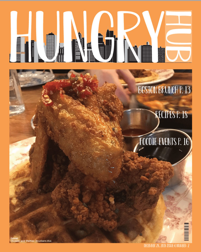
My magazine now has a permanent name, it’s called Hungry Hub, it’s all about the food in Boston. It includes any array of restaurants and eateries from the Top of the Hub to the Food Trucks that sit outside of the College of Communications. I kept this in mind while I designed the masthead of Hungry Hub.
I went through a few versions of the masthead, but finally settled on a photo of the Boston skyline superimposed behind Hungry Hub typed in a playful font. Hub is was placed on it’s side to create a more visually interesting design, when it was written horizontally the design looked cramped and short. This helped to give clear space to the design and elongate the lettering making it more visually interesting to the reader.
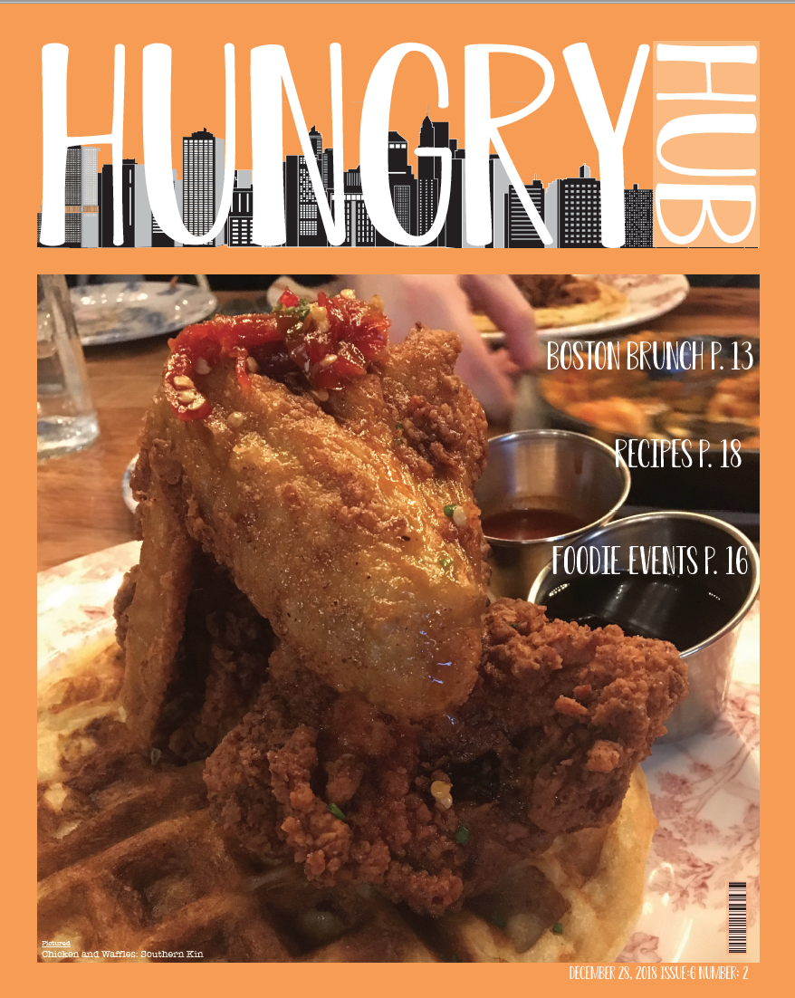
This was placed on the cover page from which I drew inspiration from a flipped polaroid picture. The photo is a large rectangle that takes up the majority of the space on the page, but leaves a blank border around it to be written on. At the top of the magazine is the mast head where the name of the magazine is written, the rest is all blank space, sans the date and issues on the bottom right corner that was intentionally made small in order to give the illusion of more blank space.
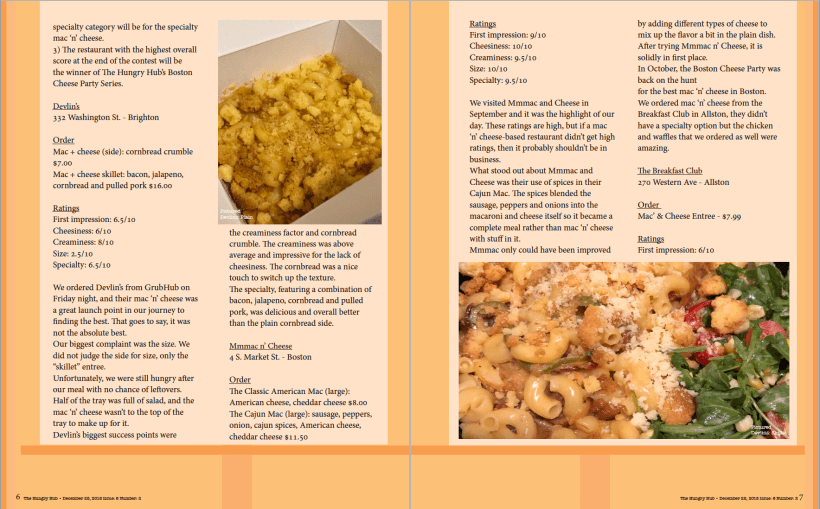
The cover page was also intentionally designed differently than the rest of the pages. While the cover page is centered focused the inside of the magazine is designed to look more whimsical. The basic article layout, I was created to be offset instead of centered like the cover. I designed the layout like this in order to keep the magazine’s layout light and airy to match the subject matter.
“All of the pages in the magazine are offset to the right and upwards to give a light and airy feel to the pages. Each page is based on a 10 piece grid structure to create a balanced structure within the spread.”
JO 512: Designing a magazine
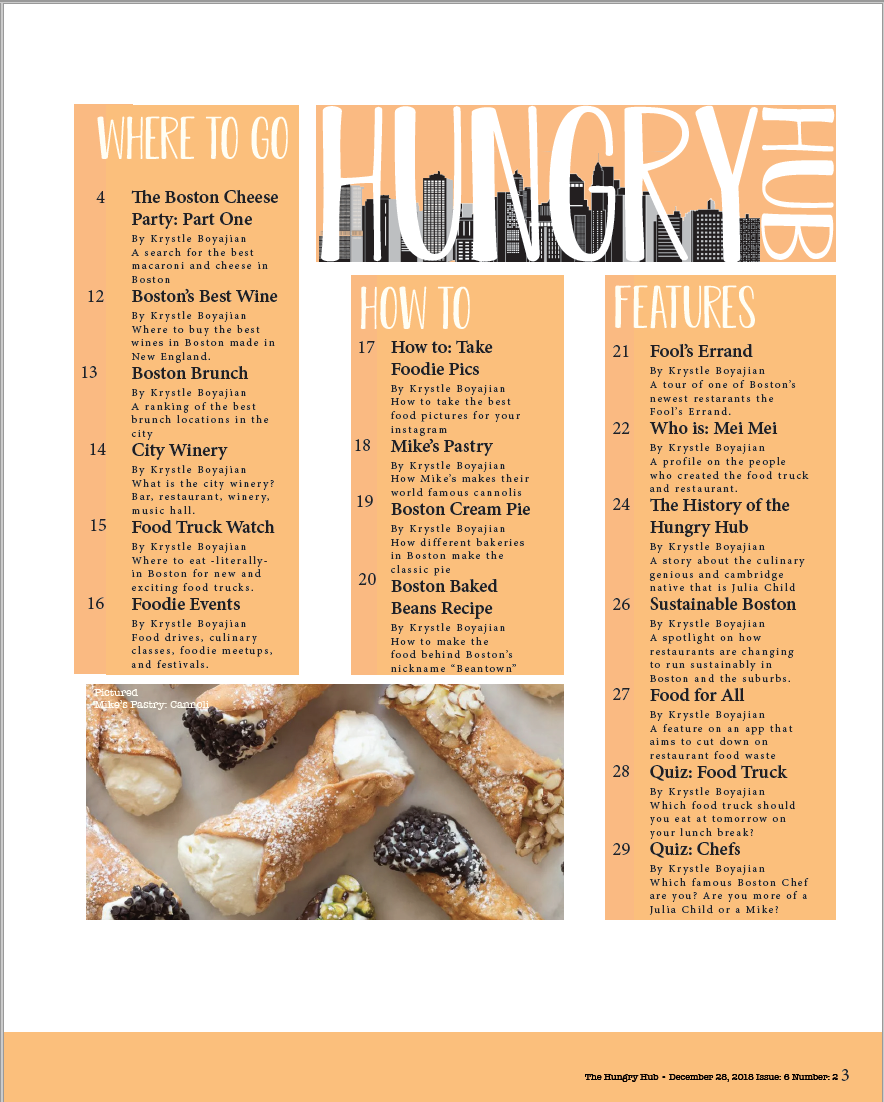
I felt that most food and restaurant magazines that I had read were high class, and felt out of touch with the average person. Hungry Hub on the other hand is ‘low brow’ it’s focused on good food not being high class. So, while Hungry Hub will write about fancy restaurants and expensive foods, it also writes about Food Trucks like Mei Mei, and little Mac & Cheese places around Boston. As you can see in the screenshot of the table of content.
The table of content albeit is for the most part fake, helps to create the style of the magazine. The one article that is real though is on page four, The Boston Cheese Party: Part One. This is a running feature in Hungry Hub so it will have more than one part. The article is all about finding the best Mac & Cheese in the Boston Area. In it, my boyfriend and order Mac & Cheese from Boston eateries (if they aren’t in Boston they must deliver to it!). We rate each Mac & Cheese on a variety of subjects, texture, creaminess, initial impression, etc. So far, Mmmac and Cheese is in the lead!
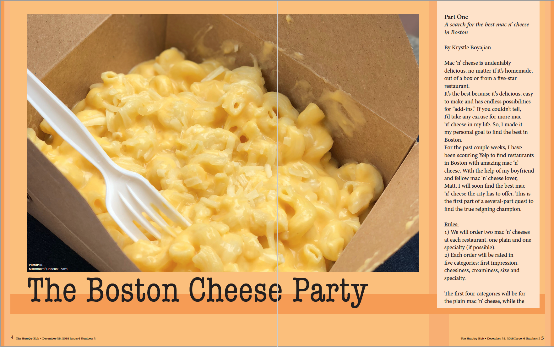
The cover of the article was also designed to be on the upper right of the page. I didn’t want to make the photo the background of the page as I felt it did not make the mac & cheese look good, so it stayed as a small inset picture. I used rectangles in different shades of orange in order to create a visually pleasing design to fill the blank space in the page. Without the rectangles the page looked empty and it failed to give off a playful vibe. The article itself is written on a pale orange rectangle. The Rectangle is pale in order to stand out from the page, but it isn’t white as it made the page look gaudy. With a pale orange box though the article appeared to be more warm and welcoming to the readers.
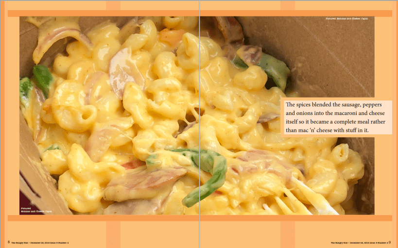
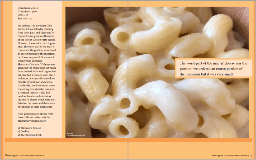
The rest of the magazine was built on the same principles, the regular article pages had the same rectangles and color scheme. The quotations were offset to the right with a pale border to give the piece pop more with the blank space. Photos never became the background of the piece, instead they were given their own space to entice the reader.
To look through the magazine scroll through the gallery below, to download a copy of the magazine scroll all the way to the bottom of the article and click download.
To download a copy of the magazine click the link below.



Leave a comment